Interior Architect Heikki Ruoho on designing the award-winning Helsinki Central Library Oodi

Oodi opened its doors to the public just one year ago and has since become a popular public space with room for more than just books. In August 2019, Oodi was chosen as the best new public library in the world by the World Library and Information Congress of the International Federation of Library Association and Institution. We asked Oodi’s Interior Architect Heikki Ruoho from ALA Architects what it was like to design such a visible space. What is the interior architect most happy about with the new building.
Oodi is a library of new era that, in addition to traditional library services, also offers diverse and innovative activities. What was most interesting in the interior design process?
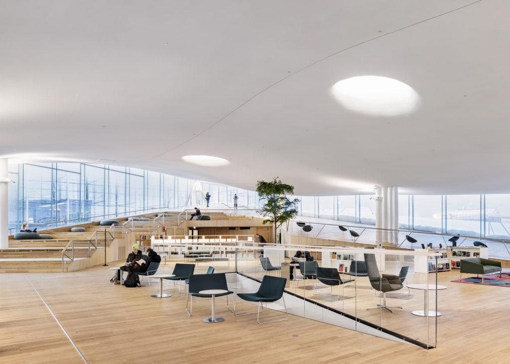
Oodi has three floors that are distinctive in their differing functions and atmosphere. Each floor had its own challenges. What is amusing is that the second floor, which contains specific functions different to those of most traditional library services, was actually the most traditional from an interior architect’s point of view. The space consists of several, separate spaces including cubicles, meeting areas, a kitchen and an area for co-working. Basically, it’s like any office. On the other hand, the first and third floor are open spaces and this openness brought its own challenges to the design process.
Tell us something about the process of choosing the furniture
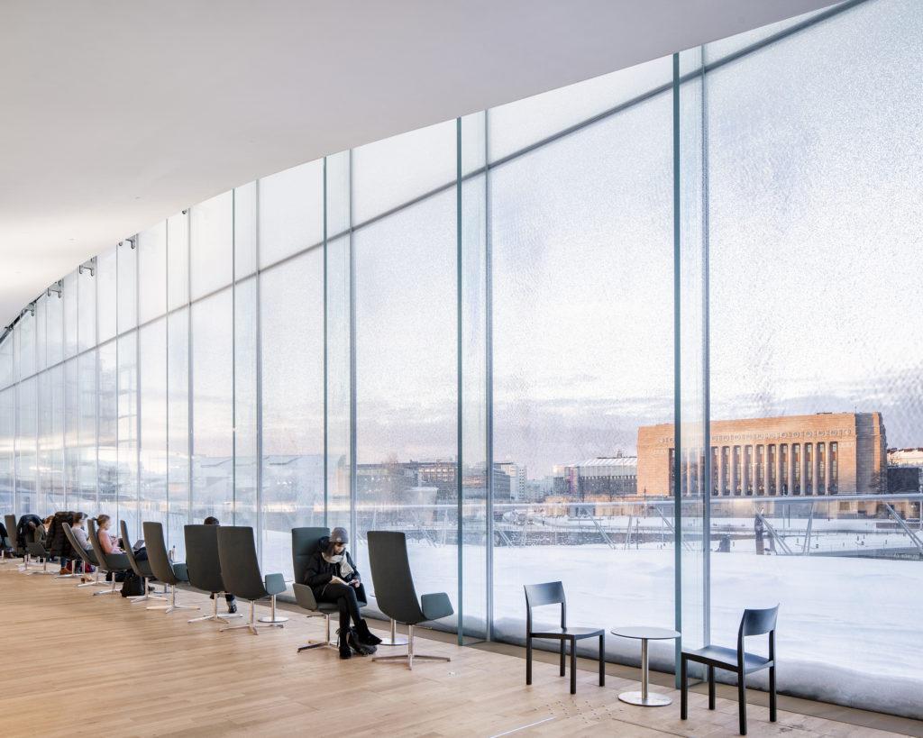
The building has a lot of plasticity, springy curves and sharp cuts as well as traditional elements such as cylinders, cubicles and other primitive shapes. With this as a starting point, we chose furniture that serves as a continuum for the design language of the building. The chairs and tables on the first floor, for example, are very primitive, archetypal objects. They could even be described as having been drawn by a child. The third floor’s armchairs also have plasticity and sinuousness in their design, as do the round, pill shaped chairs.
In choosing the furniture, I paid attention to quality and sustainability. Since the beginning of the Oodi project the principles of sustainability have been highlighted and reinforced throughout. I believe that a piece of furniture that is of good quality is automatically ecological and durable. It was great that the city of Helsinki understood the significance of this project and the importance of sustainability. We didn’t have to think solely about the price of the furniture, but were also able to invest in quality.
Oodi has been hugely popular during its first operating year. Does the interior design function in the way you thought it would?
I think we succeeded well in designing a functional space. The large number of visitors did not come as a surprise.
The third floor’s children’s section has probably required the most adjustments and the work is still in progress. For example, we are planning to make more space for baby carriages. We have also acquired more furniture around the library, such as movable tables. But those are pretty normal adjustments in any interior design process. Nothing has surprised us too much.
What is your own favorite spot in Oodi?
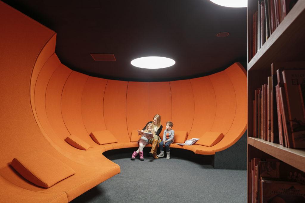
When I started working with this project in 2016, the first thing I designed was the secret story room for children located on the third floor and the first element I designed for this space was the orange, futuristic Stanley Kubrick-style couch. I think it has turned out really well and it looks exactly how I first drew it.


